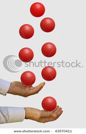
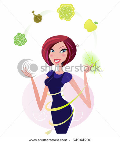
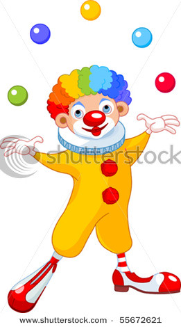
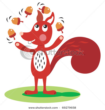
Stock art and photography are a good resource for displaying a recognizable idea, understood by all, young and old, beyond language barrier. Stock art colors the white space delivering a neutral message. The reasons stock art is good is also the same reason it’s bad. It’s a cliche and you’ve probably seen it over and over again. At its worst stock is a visual pun, or a dumbed-down illustration of an otherwise abstract idea. Juggling, sadly, has become the vehicle for stock art themes. Finance woes (juggling the books is Brian Dubé’s favorite cliche), busy at your job, busy at home, crazy for technology, health conscious, or just a disturbing juggling clown, there is juggling stock art to represent your concern. What burns me is the lack of proper juggling displayed in stock art. Juggling as a graphic is reduced into throwing balls thrown in a circle. A cascades look like juggling, and isn’t difficult to illustrate. Do non-jugglers really believe that throwing balls in a circle equals juggling? Lets view some examples:

